Logo Services

The strongest logos tell simple stories

Professional Corporate Identity Development

The ‘look’ of your company’s website is key to expressing your business’ point of difference while communicating your offering in a professional and creative way. To give you this edge, Acton BV offers you a corporate logo and Visual Identity design service.

We develop a Visual Identity that’s unique to you and your business. The foundation of your Visual Identity is your logo or ‘brandmark’ – and we are specialists in developing logos that capture the essence of a brand, grab attention, are memorable and meaningful and help build brand loyalty. As part of your logo development, we can also create a tag or strapline for your business –  telegraphing your company’s purpose with impact.

Logo Animation
goes here

Supporting Your Visual Identity

We want to help you make sure your newly-developed logo and visual identity is always applied accurately and consistently. This is how your brand builds recognition, trust, and credibility in your market.

To achieve this, we will provide you with Visual Identity Guidelines, which is a ‘rule book’ or blueprint of how your Visual Identity should and should not be displayed. This will include how your logo must be applied, the colours that may be used to represent your brand, your chosen typeface and the type and style of images/photography suitable. With this style guide at hand, you will be able to consistently communicate your corporate identity. It also gives you a foundation you can give to third parties who may work with your identity or need to apply your logo. In short, it helps you make sure your company has a unified visual front and ‘speaks with one voice.’

We LOVE our logo. Its super strong and contemporary. We think it will really help dictate our direction going forward.

Kilbaha Gallery

Our Happy Clients

We are proud to have best-in-class people within our team. Experienced specialists who work closely with each other, collaborate on every project and embrace continuous improvement in all that they do. It’s about design and creativity working together with technical excellence – fuelled by proven processes and systems.
Testimonial

“I couldn’t be more pleased with the logo and website. The copywriter, Lisa, spent considerable time understanding my perspective and beautifully captured my voice in both the brand and website copy.

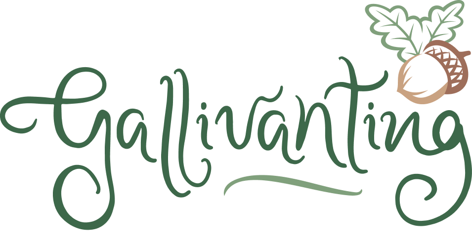
The team masterfully brought my vision to life, seamlessly blending Celtic Pagan symbolism, my personal handwriting, and the chestnut oak acorn. The playful, swirling text embodies ‘Gallivanting’ and adds a whimsical touch that truly reflects my brand. The website is engaging, user-friendly, and offers an authentic, tranquil experience for my audience.

This project exceeded my expectations, and I am thrilled with the creative and meaningful outcome.”The website is engaging, user-friendly, and provides an authentic, tranquil experience for my audience. This project exceeded my expectations, and I am thrilled with the creative and meaningful outcome.”

“I couldn’t be more pleased with the logo . The team masterfully brought my vision to life, seamlessly blending Celtic Pagan symbolism, my personal handwriting, and the chestnut oak acorn. The playful, swirling text embodies ‘Gallivanting’ and adds a whimsical touch that truly reflects my brand. The branding project exceeded my expectations, and I am thrilled with the creative and meaningful outcome.”

Lorraine