
Ireland Chauffeur Travel
the brief
Ireland Chauffeur Travel is one of the country’s leading luxury private guided tour operators.
It is an Irish family-run tour company specialising in tailor-made, high-end private guided tours of Ireland – offering luxury accommodation, transport in chauffeur-driven, premium vehicle and the best of Irish sight-seeing. The company hosts completely customised tours that treat visitors to historical and cultural attractions, beautiful countryside, vibrant pub life, food experiences and outdoor adventures.
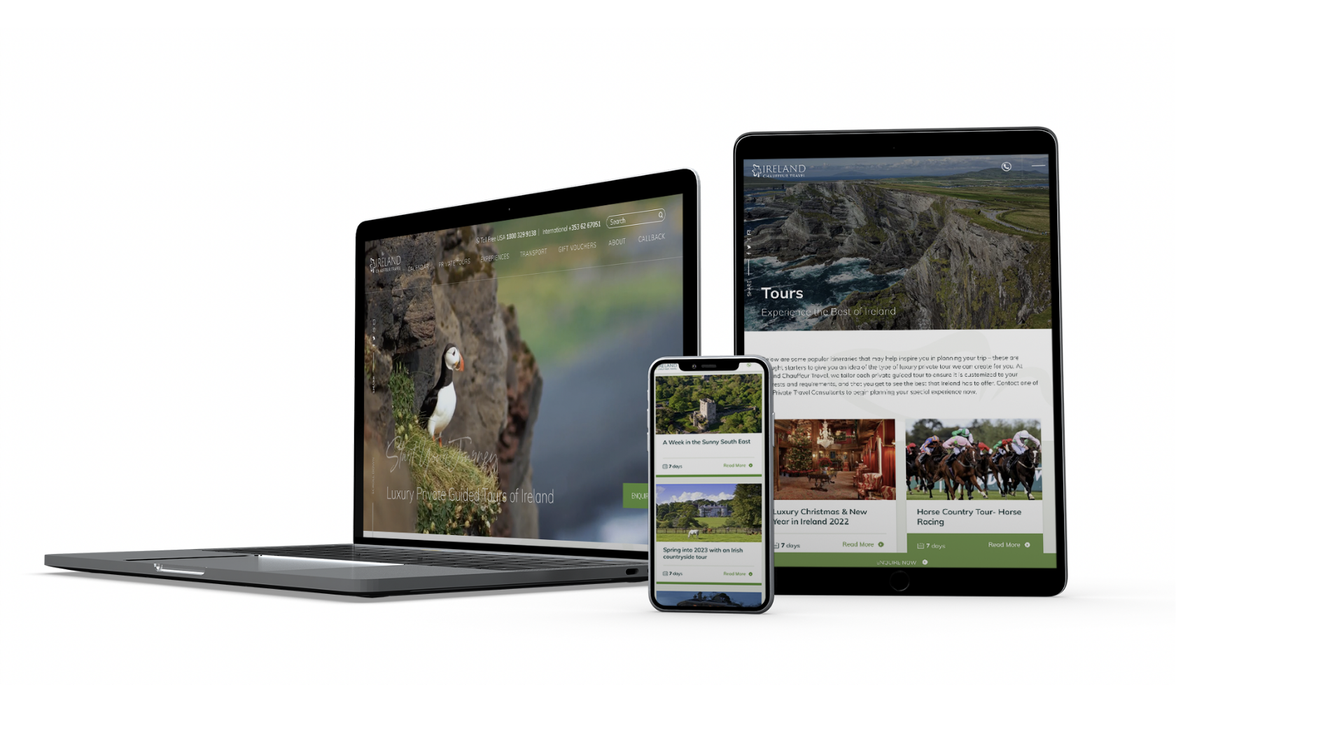
Our brief was simple: to showcase this premium offering in one, beautiful, visually arresting yet informative website.
industry
Luxury Tours
Involvement
Web Design
Development
Hosting
Booking System
our solution
The project was marked by a particularly close and successful partnership between Acton BV and the company’s marketing team.
Gaining access to information, photography and itineraries was essential – and our client trusted us all the way.
The result is a website that is as usable as it is compelling and engaging. User-experience is paramount – effortlessly connecting and inspiring users to want to take the next step and book a tour.
We LOVE our logo. Its super strong and contemporary. Wethink it will really help dictate our direction going forward.


Back to work
Lahinch Leisure Centre
Digital made for active living.
the brief
A Digital Home for Lahinch’s Active Community
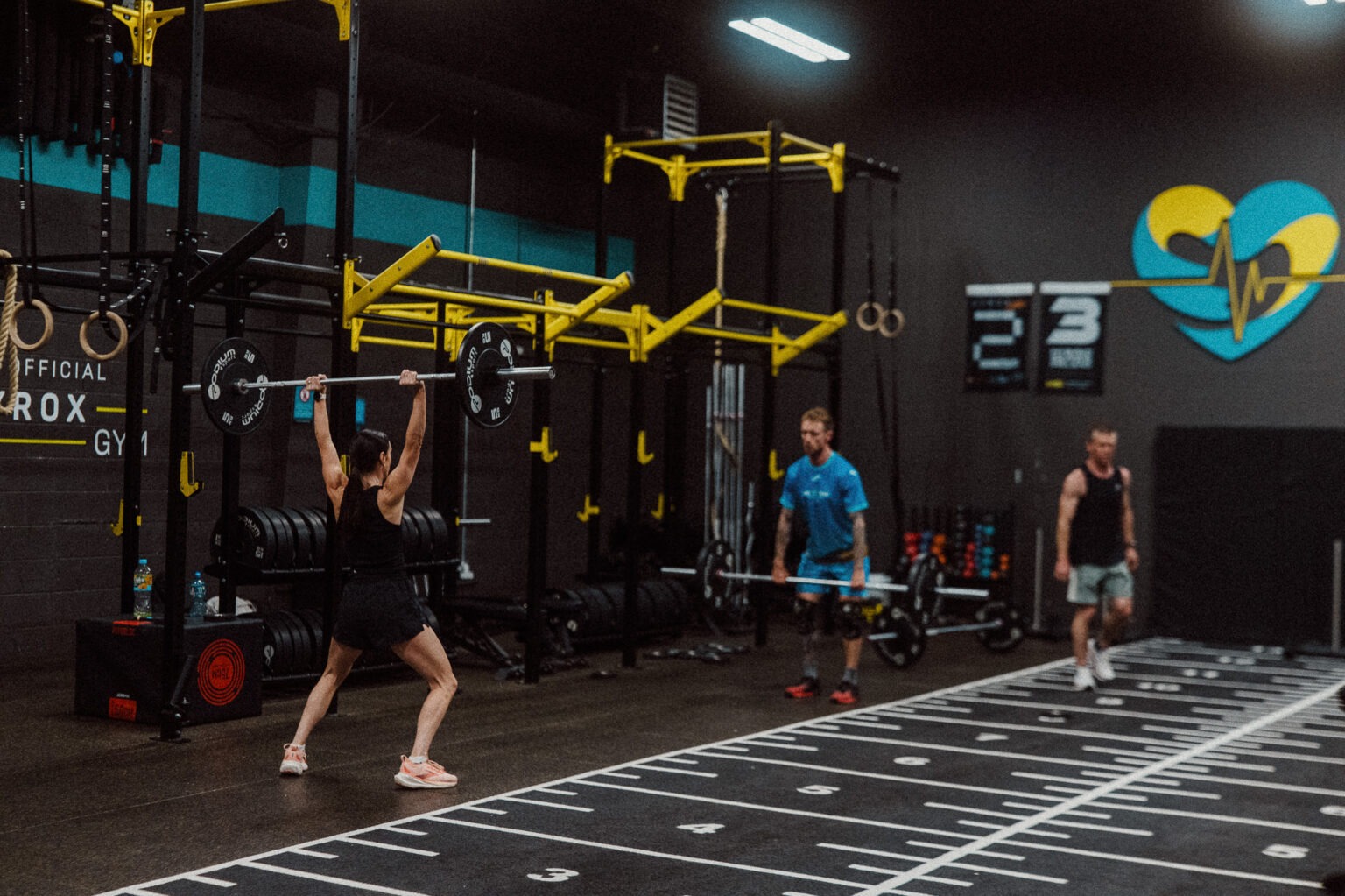
Lahinch Leisure Centre is a modern, community-focused leisure destination on the west coast, bringing fitness, swimming, health and wellbeing together in one place.
The challenge was to create a digital presence that matched the quality and energy of the centre, while making its broad range of facilities and services easy to discover and navigate.
The website needed to speak to multiple audiences — from local members and families to visitors and holidaymakers — while reflecting Lahinch’s unique coastal setting and strong connection to the community.
industry
Technology
Involvement
Web Design
Development
UX & Strategy
Content
Hosting
WEB
Making More Feel Like Less
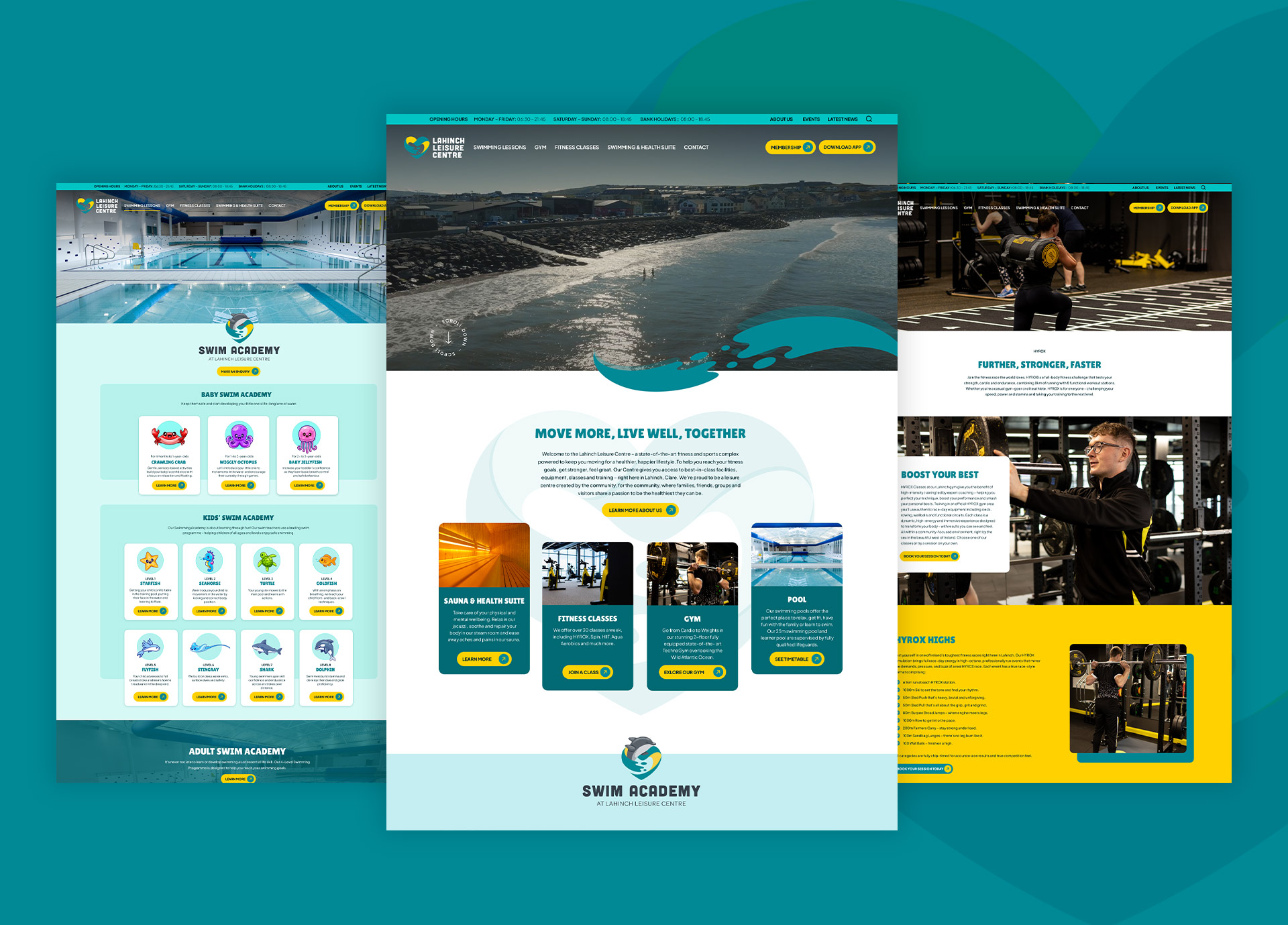
The strategy was centred on making an extensive leisure offering feel simple and accessible.
We structured the digital experience around the needs of the user, making key information such as memberships, classes, swimming, timetables and facilities easy to find and understand.
Visually, the website brings the character of Lahinch into the experience, combining a clean, contemporary interface with imagery that captures the Atlantic setting and active lifestyle associated with the centre.
The result is a digital platform that doesn’t just showcase the facilities, but gives Lahinch Leisure Centre a clear, engaging and scalable online presence — helping people discover, understand and engage with everything the centre has to offer.
Back to work
Ireland Chauffeur Travel
Quality construction built to last
the brief
A credible online presence for a trusted local builder
For over 20 years, Carakeel Construction has earned its reputation across Clare through quality workmanship and word of mouth. The challenge was bringing that same trust online with a website that feels professional, straightforward, and true to the business.
The aim was to create a clean, modern website centred around Carakeel Construction’s three main services: extensions, groundworks, and one-off builds. The content is straightforward, making it easy for homeowners to understand the services, view recent projects, and get in touch.
industry
Construction
Involvement
Branding
Web Design
Development
Hosting
Brand & Identity
A mark that communicates craft and reliability
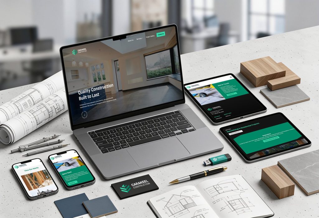
The identity was designed to reflect the reputation Carakeel Construction has built over more than 20 years. A simple, confident “CC” wordmark gives the brand a professional look that feels at home across both site signage and digital.
TThe colour palette takes its cues from the materials and environments the business works in, using dark slate tones with warm neutral colours for contrast. The identity is consistent across everything from van graphics and site boards to the website, giving the business a recognisable and professional presence wherever it’s seen.
Web Design & Development
Designed to convert enquiries, built to be found
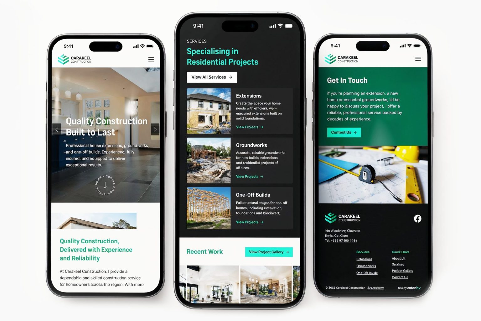
The website is structured around the information homeowners are looking for, making it easy to explore services, view completed projects, and get in touch. Project photography plays a central role throughout, giving visitors a clear picture of the standard of work Carakeel Construction delivers.
Built on WordPress, the site is easy to update and manage. Performance and SEO were considered from the outset, with fast load times and a responsive layout that works well across desktop and mobile devices.
Back to work
Tipperary Tourism
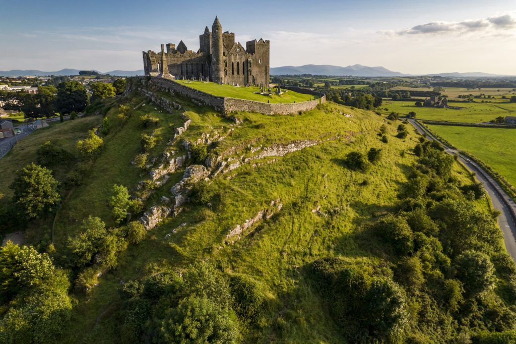
From ancient castles to misty mountains, galloping hooves, soulful stories and unforgettable tastes – Tipperary is where Ireland comes alive.
the brief
A Fresh Digital Presence for Tipperary Tourism
The previous Tipperary Tourism website had grown outdated—visually uninspiring, difficult to update, and limited in how it showcased the county’s attractions. Its structure was cluttered, and the technology behind it slowed things down, making it harder for both visitors and staff to use.
What was needed was a modern platform—immersive, vibrant, and easy to manage—that could capture the beauty, energy, and scale of Tipperary. The new site had to prioritise speed, SEO, and seamless navigation, while giving pride of place to stunning imagery, engaging video, and rich storytelling. Most importantly, it needed to inspire visitors to start planning their trip.
industry
Tourism
Involvement
Branding
Web Design
Development
Hosting
Brand strategy
A refreshed brand needs a refreshed voice, and that’s exactly what the new Tipperary identity delivers.
The old logo, while functional, felt dated and lacked the energy to match Tipperary’s ambition as a vibrant destination. The new design introduces a modern, confident mark—three elegant arch forms rising above a flowing wave. These elements symbolise Tipperary’s heritage and landscape, while the streamlined curves bring a sense of movement and vitality.
The typography has also been modernised: bold, clean, and highly legible, giving the brand a stronger presence across digital and print. Together, the refined mark and updated typeface create a visual identity that is distinctive, contemporary, and instantly recognisable—capturing the spirit of “Time for Tipperary” with clarity and impact.
WEB
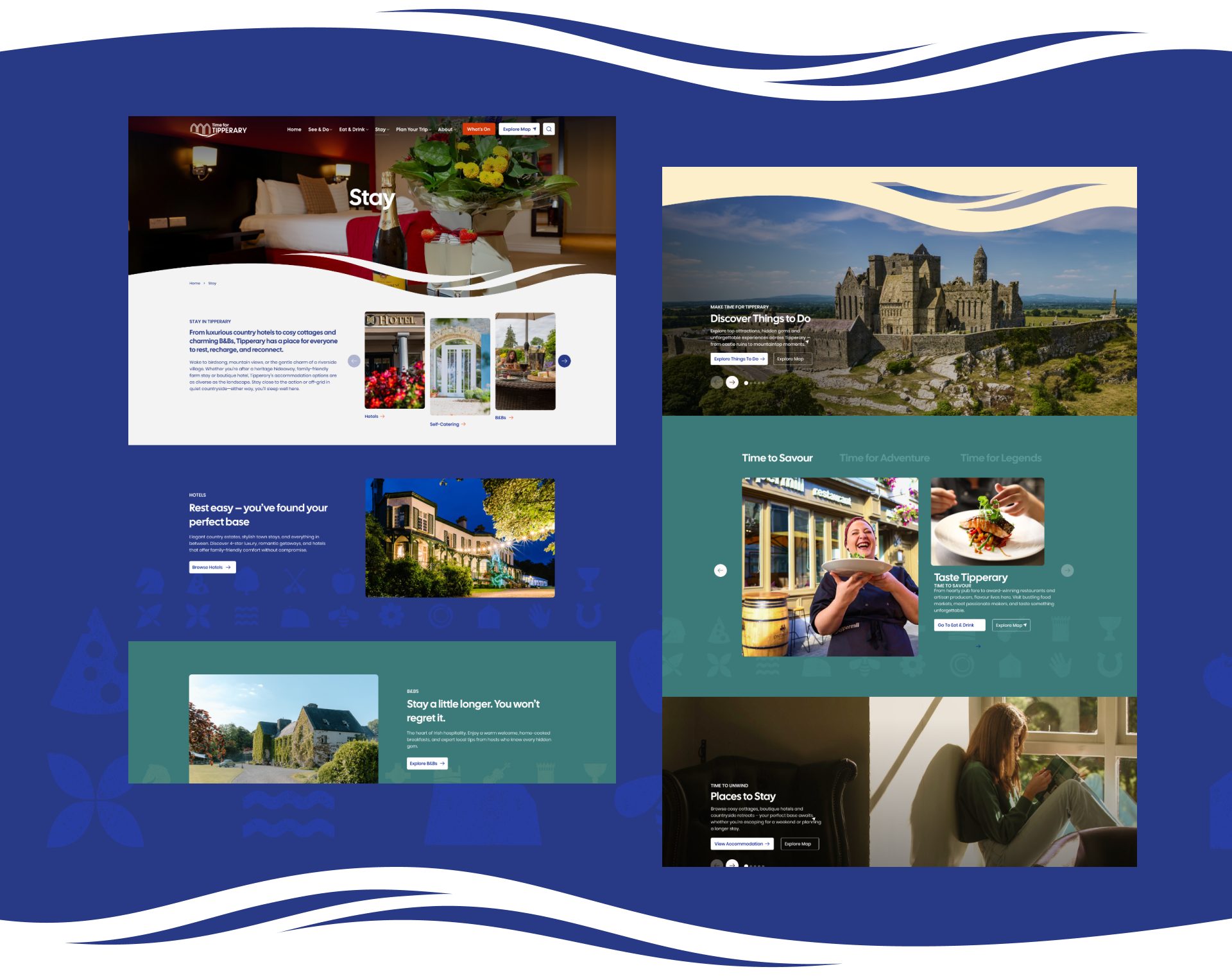
Designing for Tipperary Tourism meant creating an experience that felt as warm and welcoming as the county itself.
Our team focused on user-friendly layouts, striking imagery, and clear calls to action—ensuring visitors could easily explore hotels, B&Bs, self-catering options, and more. A fresh colour palette and bold typography give each accommodation type its own character, while still tying everything together in a consistent design language.
The site was built to be fully accessible and WCAG-compliant, so every visitor can enjoy a seamless experience. The result is a platform where travellers can discover, compare, and plan their perfect stay in Tipperary—whether it’s a luxury retreat, a family holiday, or a countryside escape.
Back to work
The Peoples Museum
Celebrate the Story of Limerick
the brief
Explore the past of our great city.
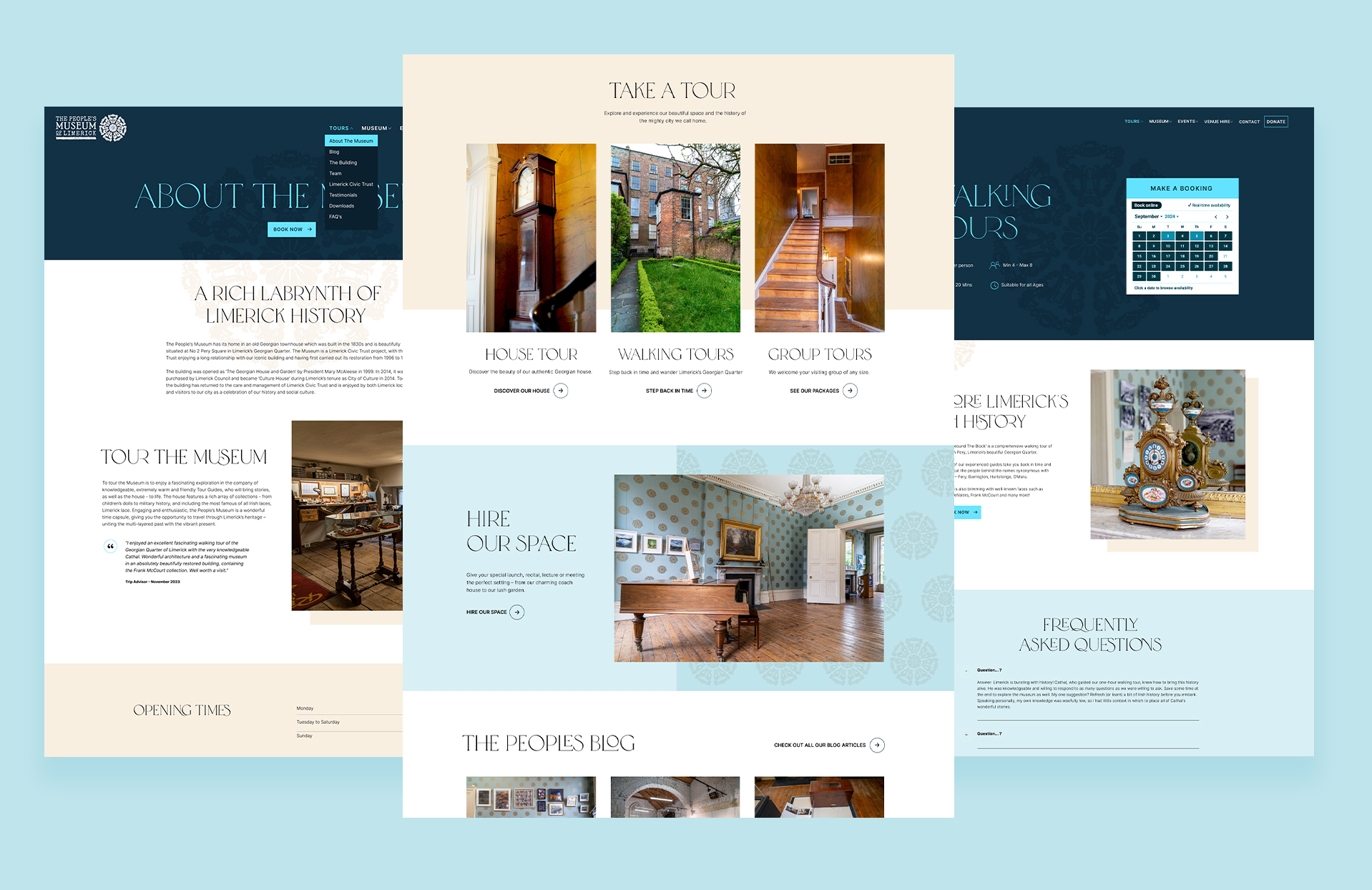
The People’s Museum partnered with ActonBV to create a new website that would bring Limerick’s history to life online. They envisioned a modern, engaging platform where visitors could explore their unique collections, captivating stories, and dynamic events. The website needed to deliver a seamless user experience, enhanced accessibility, and improved outreach, connecting a wider audience to the rich heritage the People’s Museum meticulously preserves.
industry
Tourism
Involvement
Branding
Web Design
Development
Booking system
Hosting
WEB
A captivating digital experience designed to showcase and support the client’s wide-ranging offerings.
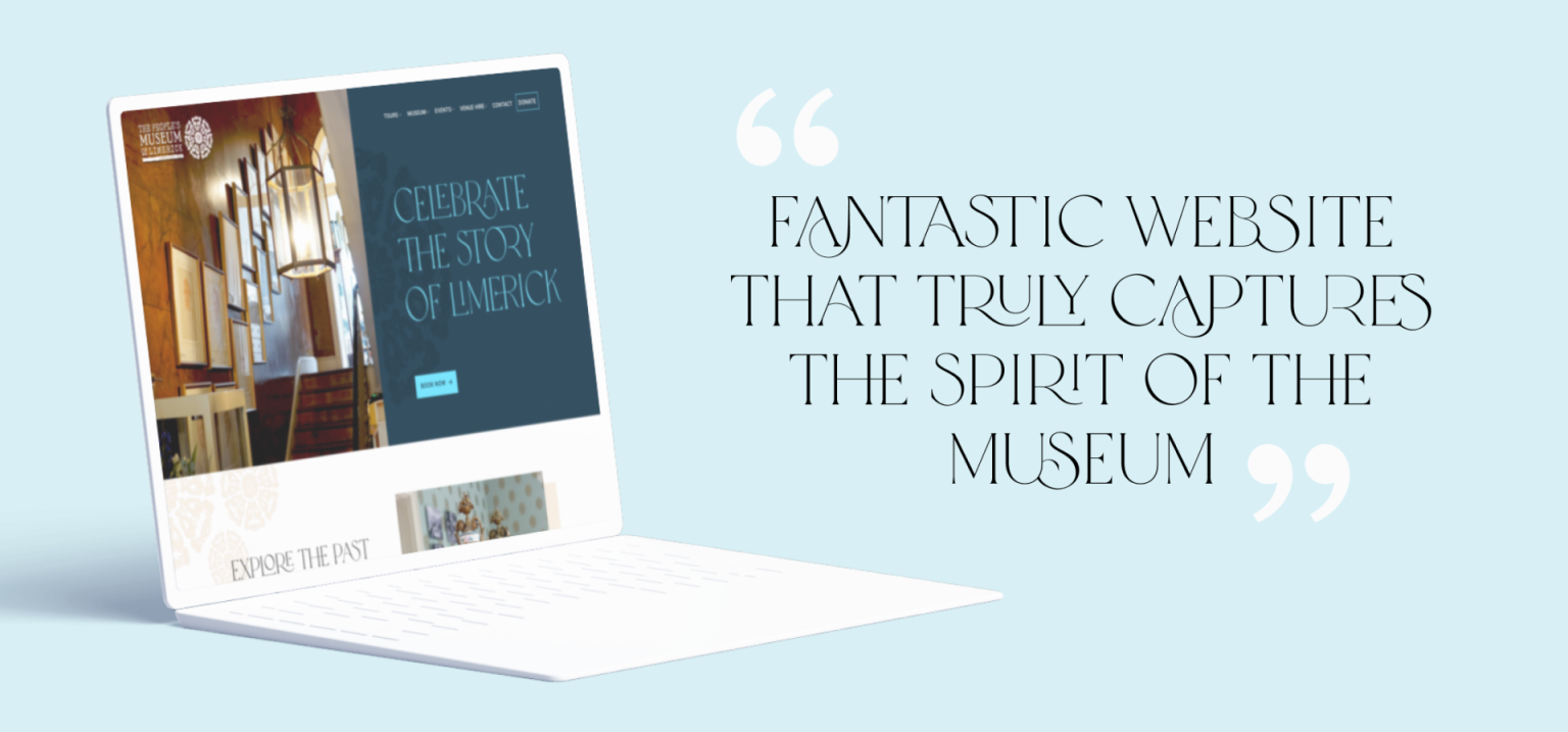
The finished website for the People’s Museum of Limerick is visually stunning and incredibly user-friendly. It beautifully captures the museum’s mission to celebrate Limerick’s rich history and culture, warmly inviting visitors to “Explore the Past of Our Great City.” The site makes it easy to book a variety of tours, including house tours, walking tours, and group experiences, while also promoting the option to rent museum spaces for private events. A dedicated blog, “The People’s Blog,” shares fascinating stories and insights into local history. Visitors can read glowing testimonials, support the museum through donations, memberships, or gift cards, and quickly get in touch using the interactive “Make an Enquiry” form. The seamless integration with Fareharbor has built trust with users and led to a remarkable increase in bookings.
Back to work
Gallivanting
From Foraging to Folklore
the brief
Embrace A World of Woodland Wonder
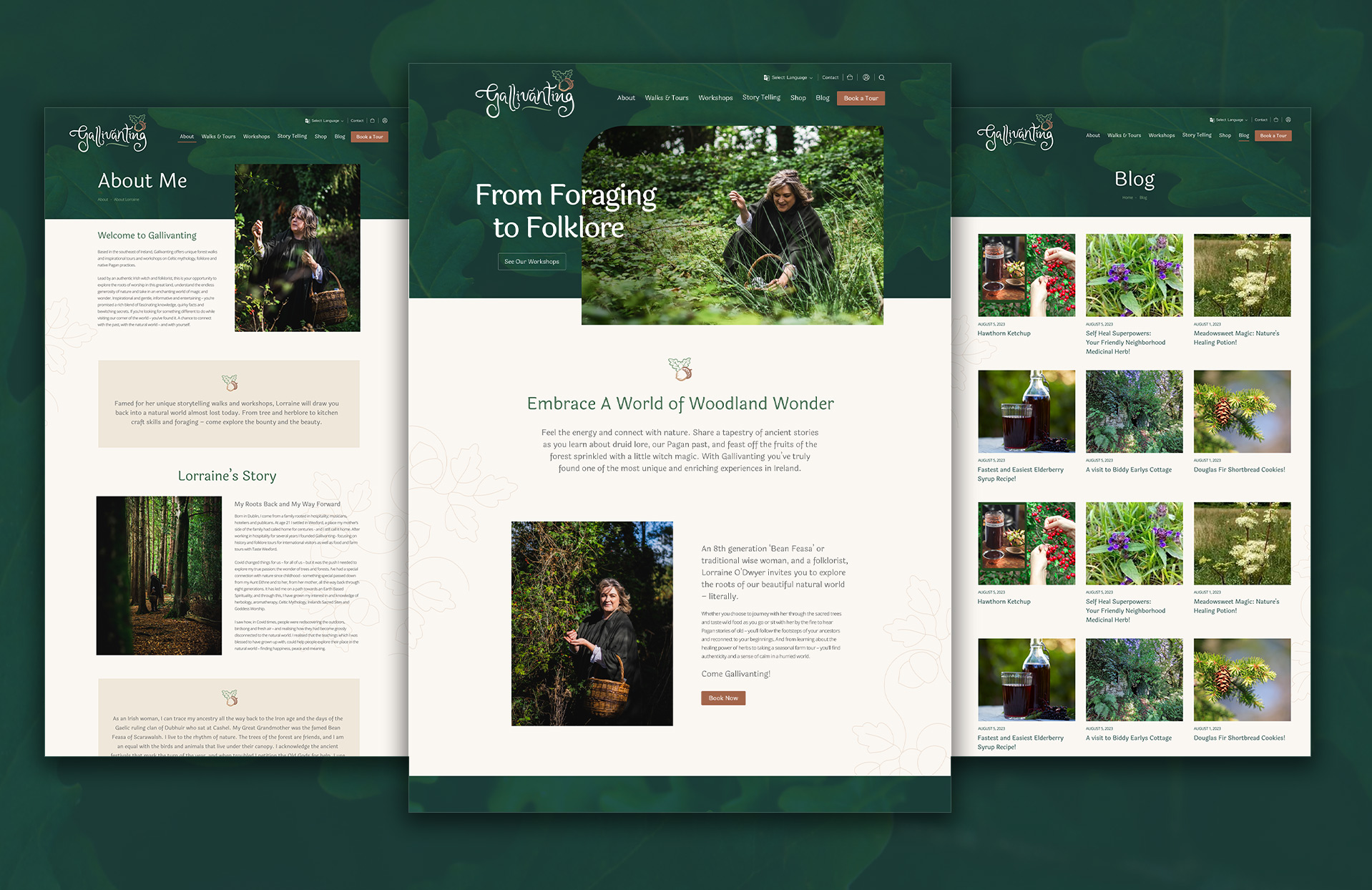
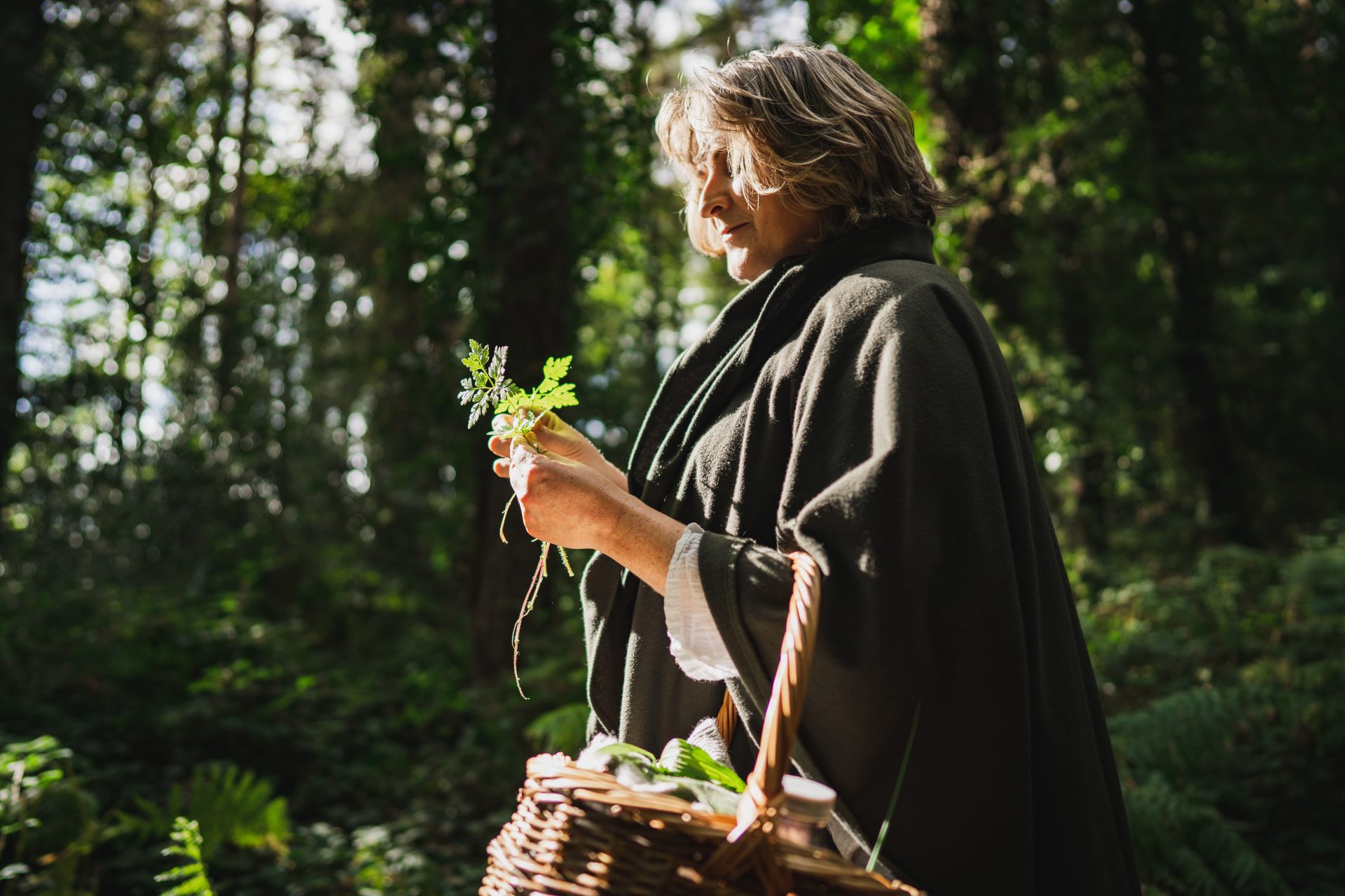
Lorraine O’Dwyer approached us to create an engaging online platform that invited users to explore sacred trees, taste wild foods, hear ancient Pagan stories by the fire, and reconnect with their roots.
Our mission was to develop a brand and user-friendly website that offered authenticity and tranquility through storytelling and interactive elements.
Our aim was to deliver a unique and memorable experience that highlights the healing power of herbs and the charm of her seasonal tours and workshops.
industry
Tourism
Involvement
Branding
Web Design
Development
Booking system
E-Commerce
Hosting
Brand strategy
From Foraging to Folklore
Drawing inspiration from Celtic Paganism’s rich tapestry of stories, symbols, and imagery, a unique logo has been crafted. This logo incorporates elements of the client’s personal handwriting and ink writing style alongside the evocative pagan swirl symbol. This fusion of personal touch with ancient symbolism offers a powerful means of self-expression, resonating with the client’s individuality while honouring ancient traditions.
Additionally, the logo draws inspiration from the chestnut oak tree’s acorn and the ink it provides, infusing whimsy and charm while celebrating the profound connection to nature revered by Celtic Pagans.
Whether for a business venture, artistic endeavor, or personal emblem, this logo serves as a visual testament to the enduring allure of Celtic Paganism and the creative potential it inspires.
WEB
An immersive online presence that supports the clients diverse offerings.
Creating the website for Lorraine O’Dwyer was an inspiring journey, blending ancient Celtic Pagan symbolism with modern design elements. We aimed to craft a platform that not only engages users but also offers an authentic and tranquil experience.
The newly designed logo, sets the tone for the site. Playful, swirling text captures the spirit of ‘Gallivanting,’ inviting visitors to explore and connect with their roots. The user-friendly design ensures seamless navigation, while the content highlights the healing power of herbs, seasonal farm tours, and captivating Pagan stories.
Additionally, we integrated a booking system for workshops, a blog to share insights and stories, and an e-commerce section for purchasing related products. This project beautifully merges tradition with innovation, creating a unique and immersive online presence that supports Lorraine’s diverse offerings.